
| 일 | 월 | 화 | 수 | 목 | 금 | 토 |
|---|---|---|---|---|---|---|
| 1 | 2 | 3 | 4 | 5 | 6 | 7 |
| 8 | 9 | 10 | 11 | 12 | 13 | 14 |
| 15 | 16 | 17 | 18 | 19 | 20 | 21 |
| 22 | 23 | 24 | 25 | 26 | 27 | 28 |
| 29 | 30 | 31 |
- 어윈 사용법
- 정수형타입
- 집합_SET
- 제네릭
- 생성자오버로드
- NestedFor
- 오라클
- EnhancedFor
- 컬렉션 타입
- 한국건설관리시스템
- exception
- 다형성
- 추상메서드
- oracle
- Java
- 사용자예외클래스생성
- 예외처리
- abstract
- 객체 비교
- 자바
- GRANT VIEW
- 컬렉션프레임워크
- 자동차수리시스템
- 예외미루기
- 메소드오버로딩
- 인터페이스
- cursor문
- 참조형변수
- 환경설정
- 대덕인재개발원
- Today
- Total
거니의 velog
(2) 프론트엔드 프로젝트 : 시작 및 회원 인증 구현 2 본문
2. 회원가입과 로그인 구현
* 지금부터는 서비스에서 회원가입 기능과 로그인 기능을 구현한다. 먼저 UI부터 개발한 다음에 리덕스를 통한 상태 관리 및 API 요청을 구현할 것이다.
(1) UI 구현하기
* 나중에 리덕스를 사용하여 컨테이너 컴포넌트를 만들고 상태 관리도 하겠지만, 지금 당장은 상태에 대해서는 신경 쓰지 않고 오직 UI만 개발하자.
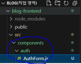
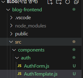
* 프레젠테이셔널 컴포넌트들은 components 디렉터리에 작성하고, 그 안에 기능별로 디렉터리를 새로 만들어서 컴포넌트를 분류할 것이다. 앞에서 Button 컴포넌트를 common이란 디렉터리에 만들었는데, 이미 설명했듯이 Button 컴포넌트는 여기저기서 재사용되는 컴포넌트이므로 common 디렉터리에 넣은 것이다. 회원 인증에 관련된 컴포넌트는 회원 인증 페이지에서만 사용되기 때문에 auth라는 디렉터리를 만들어서 그 안에 작성하겠다. 이 외에도 글쓰기에 관련된 컴포넌트는 write라는 디렉터리에 작성하고, 포스트 읽기에 관련된 컴포넌트는 post 디렉터리에 작성할 것이다.
* 회원가입과 로그인 기능을 구현하기 위해 만들어야 할 프레젠테이셔널 컴포넌트는 두 개이다. 먼저 다음 파일들을 생성해 주자. 각 컴포넌트의 역할이 무엇인지는 주석에 간략하게 적혀 앴으니 주석도 꼼꼼히 읽어 보자.
* AuthForm 컴포넌트를 작성한다.
import React from 'react';
import styled from 'styled-components';

/**
 * 회원가입 또는 로그인 폼을 보여줍니다.
 */

const AuthFormBlock = styled.div``;

const AuthForm = () => {
  return <AuthFormBlock>AuthForm</AuthFormBlock>;
};

export default AuthForm;
* 앞으로 컴포넌트를 만들 때는 styled-components로 스타일링할 것이다. 여기서는 각 컴포넌트의 최상위 컴포넌트를 선언할 때 이름 뒤에 Block이라는 단어를 붙여 줄 것인데, 보통 styled-components를 사용할 때 꼭 Block이 아니어도 Wrapper라는 단어를 붙이거나, 또는 이름 앞에 Styled라는 단어를 붙이기도 한다. StyledAuthForm처럼 말이다. 나중에 여러분이 프로젝트에서 styled-components를 사용할 때는 더 편한 네이밍 방식을 자유롭게 선택하여 이름을 짓자.
* 그럼 이제 AuthTemplate 컴포넌트를 작성한다.

import React from 'react';
import styled from 'styled-components';

/**
 * 회원가입 / 로그인 페이지의 레이아웃을 담당하는 컴포넌트입니다.
 */

const AuthTemplateBlock = styled.div``;

const AuthTemplate = () => {
  return <AuthTemplateBlock></AuthTemplateBlock>;
};

export default AuthTemplate;
* 컴포넌트를 만들 때 VS Code의 Snippet 기능을 사용하면 작업 시간을 줄일 수 있을 뿐 아니라 매우 유용하다. 이전에 확장 프로그램을 통해 Snippet을 설치하여 사용하는 방법을 알아 보았는데, 이 장에서는 Snippet을 직접 만들어서 쓰고 싶은 경우 어떻게 해야 하는지 알아보자.
* 우선 Snippet으로 사용하고 싶은 코드를 복사하자. 방금 만든 AuthTemplate 코드를 복사하자. 그리고 브라우저에 https://snippet-generator.app/ 주소를 입력한 뒤 좌측 텍스트 박스에 코드를 붙여 넣자.
https://snippet-generator.app/?description=&tabtrigger=&snippet=&mode=vscode
snippet generator
Snippet generator for Visual Studio Code, Sublime Text and Atom. Enjoy :-)
snippet-generator.app

* 이제 코드의 AuthTemplate이란 말을 모두 ${TM_FILENAME_BASE}로 대체하자. 이는 확장자를 제외한 파일 이름을 의미한다. 컴포넌트의 주석도 지우자.
import React from 'react';
import styled from 'styled-components';

const ${TM_FILENAME_BASE}Block = styled.div``;

const ${TM_FILENAME_BASE} = () => {
  return (
    <${TM_FILENAME_BASE}Block>

    </${TM_FILENAME_BASE}Block>
  );
};

export default ${TM_FILENAME_BASE};
* 이렇게 코드를 작성한 뒤 상단에 Snippet의 설명(Description...)과 줄임 단어(Tab trigger...)를 입력한다. 설명 부분에는 'Styled React Functional Component'라고 입력하고, 줄임 단어에는 'srfc'라고 입력한다.
* 모두 작성했으면 우측 하단의 Copy snippet 버튼을 누르자.

* 이 버튼을 누르면 Snippet이 복사된다. VS Code를 열어서 파일 > 기본 설정 > 사용자 코드 조각 메뉴를 누르자.
* 어떤 언어의 Snippet을 설정할 것인지 물어보면 javascriptreact를 입력하자.
* 그리고 JSON 파일 안에 방금 복사한 Snippet을 붙여 넣고 저장하자.

{
	// Place your snippets for javascriptreact here. Each snippet is defined under a snippet name and has a prefix, body and
	// description. The prefix is what is used to trigger the snippet and the body will be expanded and inserted. Possible variables are:
	// $1, $2 for tab stops, $0 for the final cursor position, and ${1:label}, ${2:another} for placeholders. Placeholders with the
	// same ids are connected.
	// Example:
	// "Print to console": {
	// 	"prefix": "log",
	// 	"body": [
	// 		"console.log('$1');",
	// 		"$2"
	// 	],
	// 	"description": "Log output to console"
	// }

	"Styled React Functional Component": {
		"prefix": "srfc",
		"body": [
		  "import React from 'react';",
		  "import styled from 'styled-components';",
		  "",
		  "const ${TM_FILENAME_BASE}Block = styled.div``;",
		  "",
		  "const ${TM_FILENAME_BASE} = () => {",
		  "  return (",
		  "    <${TM_FILENAME_BASE}Block>",
		  "    ",
		  "    </${TM_FILENAME_BASE}Block>",
		  "  );",
		  "};",
		  "",
		  "export default ${TM_FILENAME_BASE};",
		  ""
		],
		"description": "Styled React Functional Component"
	  }
}
* 이제 이 Snippet을 사용해 보자. 나중에 만들 컴포넌트 중에서 Header 컴포넌트를 만들어 보자. 이 컴포넌트는 components/base 경로에 저장한다. base는 프로젝트의 기반을 의미한다.
* Header.js 컴포넌트를 생성하고 열어 보자. 우측 하단에 언어가 JavaScript라고 나오면 방금 만든 Snippet을 사용할 수 없다.


* JavaScript로 설정되어 있으면 해당 부분을 클릭한 뒤 '.js'에 대한 파일 연결 구성 > JavaScript React를 선택하자.
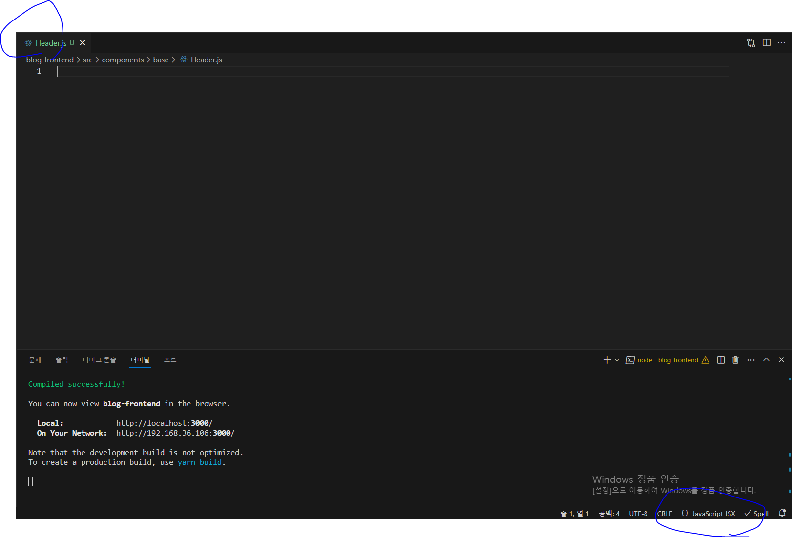
* 이제부터 새 자바스크립트 파일을 만들어서 srfc라고 입력한 뒤 Enter를 누르면 다음과 같이 코드가 자동으로 생성된다.
import React from 'react';
import styled from 'styled-components';

const HeaderBlock = styled.div``;

const Header = () => {
  return (
    <HeaderBlock>

    </HeaderBlock>
  );
};

export default Header;
* Snippet에서 사용할 수 있는 동적 값에 대해 더 알고 싶다면 다음 페이지를 참고하자.
https://code.visualstudio.com/docs/editor/userdefinedsnippets
Snippets in Visual Studio Code
It is easy to add code snippets to Visual Studio Code both for your own use or to share with others on the public Extension Marketplace. TextMate .tmSnippets files are supported.
code.visualstudio.com
* Snippet 설정을 끝낸 뒤에는 다시 AuthTemplate 컴포넌트를 열어서 children 을 렌더링하자.
import React from 'react';
import styled from 'styled-components';

/**
 * 회원가입 / 로그인 페이지의 레이아웃을 담당하는 컴포넌트입니다.
 */

const AuthTemplateBlock = styled.div``;

const AuthTemplate = ({ children }) => {
  return <AuthTemplateBlock>{children}</AuthTemplateBlock>;
};

export default AuthTemplate;
* 다음으로 LoginPage와 RegisterPage에서 방금 만든 컴포넌트들을 렌더링하자.
import React from 'react';
import AuthTemplate from '../components/auth/AuthTemplate';
import AuthForm from '../components/auth/AuthForm';

const LoginPage = () => {
  return (
    <AuthTemplate>
      <AuthForm />
    </AuthTemplate>
  );
};

export default LoginPage;
import React from 'react';
import AuthTemplate from '../components/auth/AuthTemplate';
import AuthForm from '../components/auth/AuthForm';
const RegisterPage = () => {
return (
<AuthTemplate>
<AuthForm />
</AuthTemplate>
);
};
export default RegisterPage;* 지금은 LoginPage와 RegisterPage의 결과물이 같다. 우선 페이지가 잘 나타나는지 다음 주소로 확인해 보자.
- http://localhost:3000/login

- http://localhost:3000/register

[1] AuthTemplate 완성하기
* AuthTemplate 컴포넌트는 children으로 받아 온 내용을 보여 주기만 하는 역할이므로 매우 간단하다. 이 컴포넌트의 배경은 회색이고, 중앙에 흰색 박스를 띄워 주며, 홈 경로 / 로 돌아가는 링크도 보여 준다.
import React from 'react';
import styled from 'styled-components';
import palette from '../../lib/styles/palette';
import { Link } from 'react-router-dom';

/**
 * 회원가입 / 로그인 페이지의 레이아웃을 담당하는 컴포넌트입니다.
 */

/* 화면 전체를 채움 */
const AuthTemplateBlock = styled.div`
  position: absolute;
  left: 0;
  top: 0;
  bottom: 0;
  right: 0;
  background: ${palette.gray[2]};
  /* flex로 내부 내용 중앙 정렬 */
  display: flex;
  flex-direction: column;
  justify-content: center;
  align-items: center;
`;

/* 흰색 박스 */
const WhiteBox = styled.div`
  .logo-area {
    display: block;
    padding-bottom: 2rem;
    text-align: center;
    font-weight: bold;
    letter-spacing: 2px;
  }
  box-shadow: 0 0 8px rgba(0, 0, 0, 0.025);
  padding: 2rem;
  width: 360px;
  background: white;
  border-radius: 2px;
`;

const AuthTemplate = ({ children }) => {
  return (
    <AuthTemplateBlock>
      <WhiteBox>
        <div className="logo-area">
          <Link to="/">REACTERS</Link>
        </div>
        {children}
      </WhiteBox>
    </AuthTemplateBlock>
  );
};

export default AuthTemplate;
* style-components로 컴포넌트를 스타일링할 때, 스타일링할 엘리먼트에 대해 새로운 컴포넌트 이름을 지어 줄지, 아니면 CSS Selector를 사용할지는 취향에 따라 결정하면 된다.
* 우리는 어떠한 엘리먼트에 특별한 용도가 있거나 이름을 따로 만들어 주었을 때 JSX의 가독성이 좋아진다면, styled-components를 통해 컴포넌트에 새로운 이름을 만들어 줄 것이다. 그러나 딱히 중요한 역할을 맡고 있지 않다면 CSS Selector를 활용할 것이다.
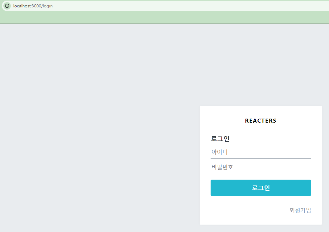
* 코드를 저장하면 로그인 페이지에 다음과 같은 결과물이 나타나는지 확인해 보자.
- http://localhost:3000/login
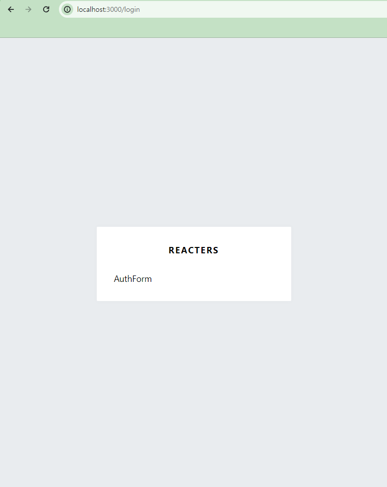
* 이 프로젝트의 이름은 REACTERS 라고 부르겠다. 이름은 여러분 마음대로 지정해도 상관없다.
[2] AuthForm 완성하기
* 이번에는 AuthForm 컴포넌트를 구성하겠다.

import React from 'react';
import styled from 'styled-components';
import { Link } from 'react-router-dom';
import palette from '../../lib/styles/palette';
import Button from '../common/Button';
/**
* 회원가입 또는 로그인 폼을 보여줍니다.
*/
const AuthFormBlock = styled.div`
h3 {
margin: 0;
color: ${palette.gray[8]};
margin-bottom: 1rem;
}
`;
/**
* 스타일링된 input
*/
const StyledInput = styled.input`
font-size: 1rem;
border: none;
border-bottom: 1px solid ${palette.gray[5]};
padding-bottom: 0.5rem;
outline: none;
width: 100%;
&:focus {
color: $oc-teal-7;
border-bottom: 1px solid ${palette.gray[7]};
}
& + & {
margin-top: 1rem;
}
`;
/**
* 폼 하단에 로그인 혹은 회원가입 링크를 보여줌
*/
const Footer = styled.div`
margin-top: 2rem;
text-align: right;
a {
color: ${palette.gray[6]};
text-decoration: underline;
&:hover {
color: ${palette.gray[9]};
}
}
`;
const AuthForm = () => {
return (
<AuthFormBlock>
<h3>로그인</h3>
<form>
<StyledInput
autoComplete="username"
name="username"
placeholder="아이디"
/>
<StyledInput
autoComplete="new-password"
name="password"
placeholder="비밀번호"
type="password"
/>
<Button>로그인</Button>
</form>
<Footer>
<Link to="/register">회원가입</Link>
</Footer>
</AuthFormBlock>
);
};
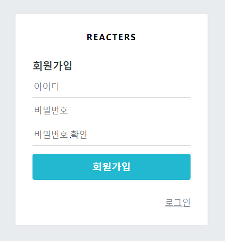
export default AuthForm;* 여기까지 코드를 작성하고 나면 다음과 같은 화면이 나타날 것이다.

* 여기서 로그인 버튼에 밝은 파란색을 넣어 주고 width를 100% 차지하는 것으로 수정해 보겠다. Button 컴포넌트를 다음과 같이 수정해 보자.
[components/common/Button.js]
import React from 'react';
import styled, { css } from 'styled-components';
import palette from '../../lib/styles/palette';

const StyledButton = styled.button`
  border: none;
  border-radius: 4px;
  font-size: 1rem;
  font-weight: bold;
  padding: 0.25rem 1rem;
  color: white;
  outline: none;
  cursor: pointer;

  background: ${palette.gray[8]};
  &:hover {
    background: ${palette.gray[6]};
  }

  ${(props) =>
    props.fullWidth &&
    css`
      padding-top: 0.75rem;
      padding-bottom: 0.75rem;
      width: 100%;
      font-size: 1.125rem;
    `}

  ${(props) =>
    props.cyan &&
    css`
      background: ${palette.cyan[5]};
      &:hover {
        background: ${palette.cyan[4]};
      }
    `}
`;

const Button = (props) => <StyledButton {...props} />;

export default Button;
* Button 컴포넌트에 cyan과 fullwidth라는 props를 넣어 주면 다른 스타일이 적용된다.
* 다시 AuthForm을 열어서 Button을 사용하는 부분을 수정해 주자.
const AuthForm = () => {
  return (
    <AuthFormBlock>
      <h3>로그인</h3>
      <form>
        <StyledInput
          autoComplete="username"
          name="username"
          placeholder="아이디"
        />
        <StyledInput
          autoComplete="new-password"
          name="password"
          placeholder="비밀번호"
          type="password"
        />
        {/* <Button cyan={true} fullWidth={true} /> */}
        <Button cyan fullWidth>
          로그인
        </Button>
      </form>
      <Footer>
        <Link to="/register">회원가입</Link>
      </Footer>
    </AuthFormBlock>
  );
};
* <Button cyan fullWidth>는 <Button cyan={true} fullWidth={true} /> 와 같은 의미이다.
* 이제 이 컴포넌트에 상단 여백을 넣어 보자. 상단 여백을 주는 방법은 두 가지이다. 첫 번째 방법은 style props를 전달해 주는 것이다.
<Button cyan fullWidth style={{ marginTop: '1rem' }}>
  로그인
</Button>
* 두 번째 방법은 styled 함수를 사용하여 새로운 컴포넌트 이름으로 정의하는 것이다.
const ButtonWithMarginTop = styled(Button)`
  margin-top: 1rem;
`;

const AuthForm = () => {
  return (
    <AuthFormBlock>
      <h3>로그인</h3>
      <form>
        <StyledInput
          autoComplete="username"
          name="username"
          placeholder="아이디"
        />
        <StyledInput
          autoComplete="new-password"
          name="password"
          placeholder="비밀번호"
          type="password"
        />
        <ButtonWithMarginTop cyan fullWidth>
          로그인
        </ButtonWithMarginTop>
      </form>
      <Footer>
        <Link to="/register">회원가입</Link>
      </Footer>
    </AuthFormBlock>
  );
};
* 두 번째 방식을 사용하는 것을 선호한다. 가독성이 더 좋기 때문이다.
* 밝은 파란색 컴포넌트가 잘 나타났는가?
* 이제 AuthForm에서 type props에 따라 다른 내용을 보여 주도록 수정해 보자. type 값에 따라 사용되는 문구도 달라지고, type이 'register'일 때는 비밀번호 확인 인풋도 보여 준다.
const textMap = {
  login: '로그인',
  register: '회원가입',
};

const AuthForm = ({ type }) => {
  const text = textMap[type]; // 타입(login, register)에 따라 출력되는 text의 값이 다르다.
  return (
    <AuthFormBlock>
      <h3>{text}</h3>
      <form>
        <StyledInput
          autoComplete="username"
          name="username"
          placeholder="아이디"
        />
        <StyledInput
          autoComplete="new-password"
          name="password"
          placeholder="비밀번호"
          type="password"
        />
        {type === 'register' && (
          <StyledInput
            autoComplete="new-password"
            name="passwordConfirm"
            placeholder="비밀번호 확인"
            type="password"
          />
        )}
        <ButtonWithMarginTop cyan fullWidth>
          {text}
        </ButtonWithMarginTop>
      </form>
      <Footer>
        {type === 'login' ? (
          <Link to="/register">회원가입</Link>
        ) : (
          <Link to="/login">로그인</Link>
        )}
      </Footer>
    </AuthFormBlock>
  );
};

export default AuthForm;
* LoginPage와 RegisterPage에서 AuthForm을 사용할 때 type을 넣어 주자.
[pages/LoginPage.js]
import React from 'react';
import AuthTemplate from '../components/auth/AuthTemplate';
import AuthForm from '../components/auth/AuthForm';

const LoginPage = () => {
  return (
    <AuthTemplate>
      <AuthForm type="login" />
    </AuthTemplate>
  );
};

export default LoginPage;
[pages/RegisterPage.js]
import React from 'react';
import AuthTemplate from '../components/auth/AuthTemplate';
import AuthForm from '../components/auth/AuthForm';

const RegisterPage = () => {
  return (
    <AuthTemplate>
      <AuthForm type="register" />
    </AuthTemplate>
  );
};

export default RegisterPage;
* /login과 /register 페이지에서 문구가 제대로 나타나는지 확인해 보자.
- http://localhost:3000/login

- http://localhost:3000/register
* 이제 회원 인증에 필요한 UI를 모두 완성했다.
'React > React_프론트엔드 프로젝트' 카테고리의 다른 글
| (6) 프론트엔드 프로젝트 : 시작 및 회원 인증 구현 6 (0) | 2024.02.22 |
|---|---|
| (5) 프론트엔드 프로젝트 : 시작 및 회원 인증 구현 5 (0) | 2024.02.22 |
| (4) 프론트엔드 프로젝트 : 시작 및 회원 인증 구현 4 (0) | 2024.02.22 |
| (3) 프론트엔드 프로젝트 : 시작 및 회원 인증 구현 3 (0) | 2024.02.22 |
| (1) 프론트엔드 프로젝트 : 시작 및 회원 인증 구현 1 (0) | 2024.02.21 |


