
| 일 | 월 | 화 | 수 | 목 | 금 | 토 |
|---|---|---|---|---|---|---|
| 1 | 2 | 3 | 4 | 5 | 6 | 7 |
| 8 | 9 | 10 | 11 | 12 | 13 | 14 |
| 15 | 16 | 17 | 18 | 19 | 20 | 21 |
| 22 | 23 | 24 | 25 | 26 | 27 | 28 |
- 정수형타입
- 사용자예외클래스생성
- 자바
- cursor문
- 생성자오버로드
- 다형성
- 예외처리
- exception
- Java
- 예외미루기
- 컬렉션프레임워크
- EnhancedFor
- 인터페이스
- 집합_SET
- 컬렉션 타입
- 한국건설관리시스템
- NestedFor
- 객체 비교
- 환경설정
- oracle
- 자동차수리시스템
- GRANT VIEW
- 추상메서드
- 제네릭
- 오라클
- abstract
- 어윈 사용법
- 메소드오버로딩
- 대덕인재개발원
- 참조형변수
- Today
- Total
거니의 velog
(21) 컴포넌트 스타일링 1 본문
* 리액트에서 컴포넌트를 스타일링할 때는 다양한 방식을 사용할 수 있다. 여러 방식 중에서 딱히 정해진 방식이란 없다. 회사마다 요구하는 스펙이 다르고, 개발자마다 각자 취향에 따라 선택하기 때문이다. 이 장에서는 어떠한 방식이 있는지 알아보고, 자주 사용하는 방식을 하나하나 사용해 보도록 하겠다.
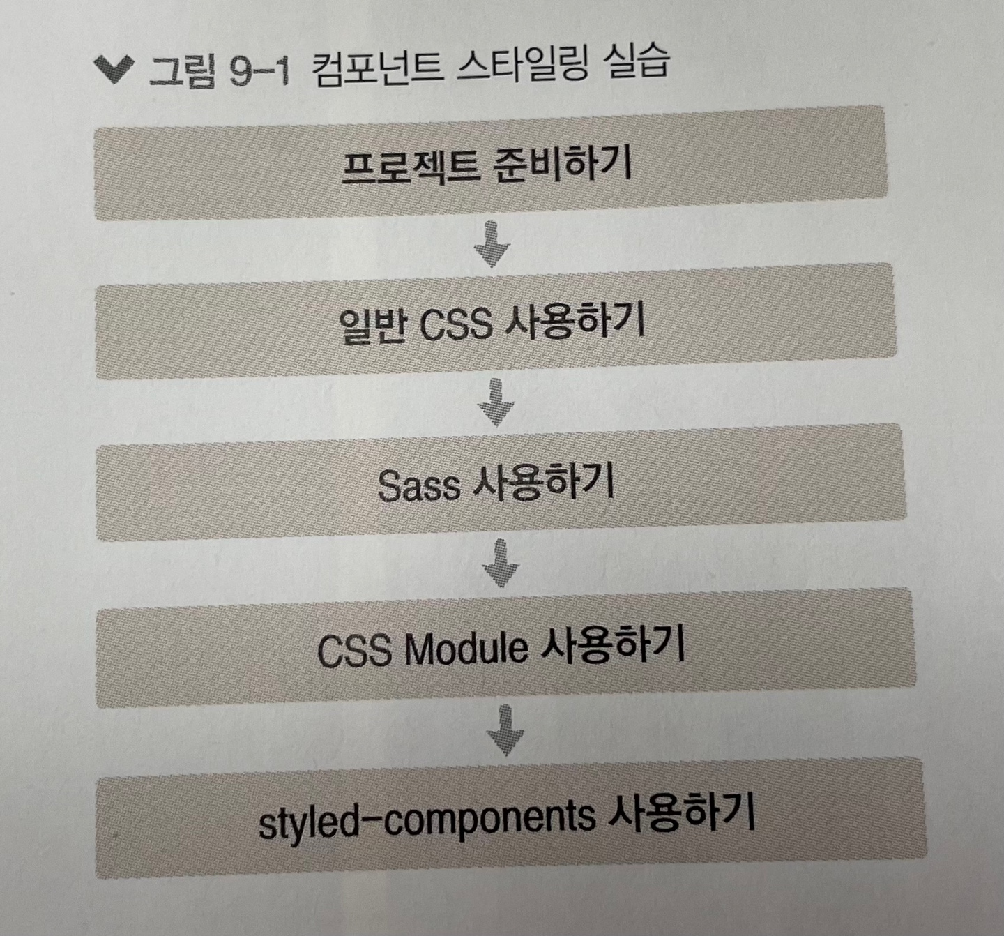
* 이 장에서 알아볼 스타일링 방식은 다음과 같다.
- 일반 CSS : 컴포넌트를 스타일링하는 가장 기본적인 방식이다.

- Sass : 자주 사용되는 CSS 전처리기(pre-proccessor)중 하나로 확장된 CSS 문법을 사용하여 CSS 코드를
  더욱 쉽게 작성할 수 있게 해 준다.

- CSS Module : 스타일을 작성할 때 CSS 클래스가 다른 CSS 클래스의 이름과 절대 충돌하지 않도록 파일마다
  고유한 이름을 자동으로 생성해 주는 옵션이다.

- styled-components : 스타일을 자바스크립트 파일에 내장시키는 방식으로 스타일을 작성함과 동시에 해당
  스타일이 적용된 컴포넌트를 만들 수 있게 해 준다.
* 실습은 다음 흐름으로 진행된다.
[프로젝트 준비하기]
* 우선 create-react-app을 사용하여 새로운 프로젝트를 만들고 개발 서버를 시작하자. 개발 서버를 시작할 때 이전에 사용하던 프로젝트의 개발 서버가 있다면 종료해 주어야 한다. 종료하려면 터미널 창에서 Ctrl + C를 입력한다.
$ yarn create react-app styling-react
$ cd styling-react
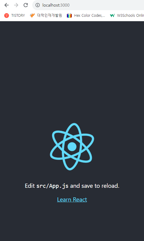
$ yarn start* 프로젝트 생성이 완료되면 해당 디렉터리를 에디터로 열어 보자.
1. 가장 흔한 방식, 일반 CSS
* 프로젝트는 일반 CSS 방식으로 만들어져 있다. 기존의 CSS 스타일링이 딱히 불편하지 않고 새로운 기술을 배울 필요가 없다고 생각되면, 일반 CSS를 계속 사용해도 상관 없다.
* 실제로도 소규모 프로젝트를 개발하고 있다면 새로운 스타일링 시스템을 적용하는 것이 불필요할 수도 있다. 그런 상황에는 프로젝트에 이미 적용되어 있는 기본 CSS 시스템을 사용하는 것만으로도 충분하다.
* 방금 만든 프로젝트를 보면 src 디렉터리에 App.js 파일과 App.css 파일이 있다.
import logo from './logo.svg';
import './App.css';

function App() {
  return (
    <div className="App">
      <header className="App-header">
        <img src={logo} className="App-logo" alt="logo" />
        <p>
          Edit <code>src/App.js</code> and save to reload.
        </p>
        <a
          className="App-link"
          href="https://reactjs.org"
          target="_blank"
          rel="noopener noreferrer"
        >
          Learn React
        </a>
      </header>
    </div>
  );
}

export default App;
.App {
text-align: center;
}
.App-logo {
height: 40vmin;
pointer-events: none;
}
@media (prefers-reduced-motion: no-preference) {
.App-logo {
animation: App-logo-spin infinite 20s linear;
}
}
.App-header {
background-color: #282c34;
min-height: 100vh;
display: flex;
flex-direction: column;
align-items: center;
justify-content: center;
font-size: calc(10px + 2vmin);
color: white;
}
.App-link {
color: #61dafb;
}
@keyframes App-logo-spin {
from {
transform: rotate(0deg);
}
to {
transform: rotate(360deg);
}
}* CSS를 작성할 때 가장 중요한 점은 CSS 클래스를 중복되지 않게 만드는 것이다. CSS 클래스가 중복되는 것을 방지하는 여러 가지 방식이 있는데, 그 중 하나는 이름을 지을 때 특별한 규칙을 사용하여 짓는 것이고, 또 다른 하나는 CSS Selector를 활용하는 것이다.
(1) 이름 짓는 규칙
* 프로젝트에 자동 생성된 App.css를 읽어 보면 클래스 이름이 컴포넌트 이름-클래스 형태로 지어져 있다(예: App-header). 클래스 이름에 컴포넌트 이름을 포함시킴으로써 다른 컴포넌트에서 실수로 중복되는 클래스를 만들어 사용하는 것을 방지할 수 있다. 비슷한 방식으로 BEM 네이밍(BEM Naming)이라는 방식도 있다. BEM 네이밍은 CSS 방법론 중 하나로, 이름을 지을 때 일종의 규칙을 준수하여 해당 클래스가 어디에서 어떤 용도로 사용되는지 명확하게 작성하는 방식이다. 예를 들어, .card_title-primary 처럼 말이다.
(2) CSS Selector
* CSS Selector를 사용하면 CSS 클래스가 특정 클래스 내부에 있는 경우에만 스타일을 적용할 수 있다. 예를 들어 .App 안에 들어 있는 .logo에 스타일을 적용하고 싶다면 다음과 같이 작성하면 된다.
.App .logo {
    animation: App-logo-spin infinite 20s linear;
    height: 40vmin;
}
* 이러한 방식을 사용하여 기존 App.css와 App.js 의 CSS 클래스 부분을 다시 작성해 보자. 우선 CSS 파일을 이렇게 수정해 보자.
.App {
  text-align: center;
}

/* App 안에 들어 있는 .logo */
.App .logo {
  animation: App-logo-spin infinite 20s linear;
  height: 40vmin;
}

/*
  App 안에 들어 있는 header
  header 클래스가 아닌 header 태그 자체에
  스타일을 적용하기 때문에 .이 생략되었다.
*/
.App header {
  background-color: #282c34;
  min-height: 100vh;
  display: flex;
  flex-direction: column;
  align-items: center;
  justify-content: center;
  font-size: calc(10px + 2vmin);
  color: white;
}

/* .App 안에 들어 있는 a 태그 */
.App a {
  color: #61dafb;
}

@keyframes App-logo-spin {
  from {
    transform: rotate(0deg);
  }
  to {
    transform: rotate(360deg);
  }
}
* 그리고 이에 맞춰 컴포넌트의 JSX 부분을 수정해 보자.
import React, { Component } from "react";
import logo from "./logo.svg";
import "./App.css";

class App extends Component {
  render() {
    return (
      <div className="App">
        <header>
          <img src={logo} className="logo" alt="logo" />
          <p>
            Edit <code>src/App.js</code> and save to reload.
          </p>
          <a
            href="https://reactjs.org"
            target="_blank"
            rel="noopener noreferrer"
          >
            Learn React
          </a>
        </header>
      </div>
    );
  }
}

export default App;
* 이런 식으로 컴포넌트의 최상위 html 요소에는 컴포넌트의 이름으로 클래스 이름을 짓고(.App), 그 내부에서는 소문자를 입력하거나 (.logo), header와 같은 태그를 사용하여 클래스 이름이 불필요한 경우에는 아예 생략할 수도 있다.
2. Sass 사용하기
* Sass(Syntactically Awesome Style Sheets) : (문법적으로 매우 멋진 스타일시트)는 CSS 전처리기로 복잡한 작업을 쉽게 할 수 있도록 해 주고, 스타일 코드의 재활용성을 높여 줄 뿐만 아니라 코드의 가독성을 높여서 유지 보수를 더욱 쉽게 해 준다.
* create-react-app 구버전에서는 Sass를 사용하려면 추가 작업이 필요했는데, v2 버전 부터는 별도의 추가 설정 없이 바로 사용할 수 있다.
* Sass에서는 두 가지 확장자 .scss와 .sass를 지원한다. Sass가 처음 나왔을 때는 .sass 확장자만 지원되었으나 나중에 개발자들의 요청에 의해 .scss 확장자도 지원하게 되었다.
* .scss의 문법과 .sass의 문법은 꽤 다르다. 다음 코드를 한번 확인해 보자.
* .sass 인 경우

$font-stack: Helvetica, sans-serif
$primary-color: #333

body
    font: 100% #font-stack
    color: $primary-color: #333
* .scss인 경우
$font-stack: Helvetica, sans-serif;
$primary-color: #333;
body {
font: 100% $font-stack;
color : $primary-color;
}* 주요 차이점을 살펴보면, .sass 확장자는 중괄호({ })와 세미콜론(;)을 사용하지 않는다. 반면 .scss 확장자는 기존 CSS를 작성하는 방식과 비교해서 문법이 크게 다르지 않다.
* 보통 .scss 문법이 더 자주 사용되므로 우리는 .scss 확장자를 사용하여 스타일을 작성해 볼 것이다.
* 새 컴포넌트를 만들어서 Sass를 한번 사용해 보자! 우선 node-sass 라는 라이브러리를 설치해 주어야 한다. 이 라이브러리는 Sass를 CSS로 변환해 준다. 프로젝트 디렉터리에서 다음 명령어를 실행하자.
$ yarn add node-sass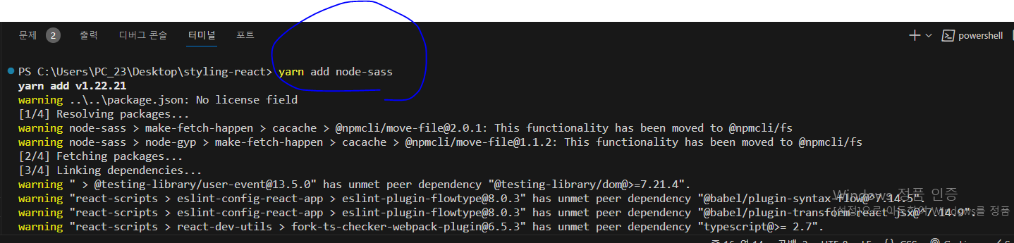
* 설치가 완료되면 src 디렉터리에 다음과 같이 SassComponent.scss 파일을 작성해 보자.

// 변수 사용하기
$red: #fa5252;
$orange: #fd7e14;
$yellow: #fcc419;
$green: #40c057;
$blue: #339af0;
$indigo: #5c7cfa;
$violet: #7950f2;
// 믹스인 만들기(재사용되는 스타일 블록을 함수처럼 사용할 수 있음)
@mixin square($size) {
    $calculated: 32px * $size;
    width: $calculated;
    height: $calculated;
}

.SassComponent {
    display: flex;
    .box { // 일반 CSS에서는 .SassComponent .box와 마찬가지
        background: red;
        cursor: pointer;
        transition: all 0.3s ease-in;
        &.red {
            // .red 클래스가 .box와 함께 사용되었을 때
            background: $red;
            @include square(1);
        }
        &.orange {
            background: $orange;
            @include square(2);
        }
        &.yellow {
            background: $yellow;
            @include square(3);
        }
        &.green {
            background: $green;
            @include square(4);
        }
        &.blue {
            background: $blue;
            @include square(5);
        }
        &.indigo {
            background: $indigo;
            @include square(6);
        }
        &.violet {
            background: $violet;
            @include square(7);
        }
        &.hover {
            // .box에 마우스를 올렸을 때
            background: black;
        }
    }
}
* 그리고 이 Sass 스타일시트를 사용하는 SassComponent.js 컴포넌트 파일도 src에 만들자.
import React from "react";
import "./SassComponent.scss";

const SassComponent = () => {
  return (
    <div className="SassComponent">
      <div className="box red"></div>
      <div className="box orange"></div>
      <div className="box yellow"></div>
      <div className="box green"></div>
      <div className="box blue"></div>
      <div className="box indigo"></div>
      <div className="box violet"></div>
    </div>
  );
};

export default SassComponent;
* 이제 이 컴포넌트를 App 컴포넌트에서 보여 주자.
import React, { Component } from "react";
import SassComponent from "./SassComponent";
class App extends Component {
render() {
return (
<div>
<SassComponent />
</div>
);
}
}
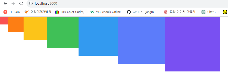
export default App;* 작업한 뒤에는 개발 서버를 재시작시켜야 Sass가 성공적으로 적용된다. 개발 서버가 구동 중인 터미널 창에서 Ctrl + C를 누르고, 다시 yarn start 명령어를 입력하자. 그러고 나면 다음과 같은 페이지가 나타날 것이다.
(1) utils 함수 분리하기
* 여러 파일에서 사용될 수 있는 Sass 변수 및 믹스인은 다른 파일로 따로 분리하여 작성한 뒤 필요한 곳에서 쉽게 불러와 사용할 수 있다.
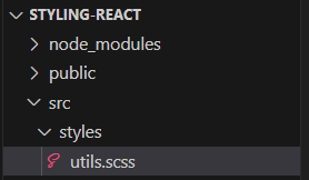
* src 디렉터리에 styles라는 디렉터리를 생성하고, 그 안에 utils.scss 파일을 만들자. 그 다음에는 기존 SassComponent.scss에 작성했던 변수와 믹스인을 잘라내서 이동시켜 보자.
// 변수 사용하기
$red: #fa5252;
$orange: #fd7e14;
$yellow: #fcc419;
$green: #40c057;
$blue: #339af0;
$indigo: #5c7cfa;
$violet: #7950f2;

// 믹스인 만들기(재사용되는 스타일 블록을 함수처럼 사용할 수 있음)
@mixin square($size) {
    $calculated: 32px * $size;
    width: $calculated;
    height: $calculated;
}
* 이제 utils.scss 파일에서 선언한 변수와 믹스인을 SassComponent.scss에서 사용해 보자. 다른 scss 파일을 불러올 때는 @import 구문을 사용한다.
@import './styles/utils';

.SassComponent {
    display: flex;
    .box { // 일반 CSS에서는 .SassComponent .box와 마찬가지
        background: red;
        cursor: pointer;
        transition: all 0.3s ease-in;
        &.red {
            // .red 클래스가 .box와 함께 사용되었을 때
            background: $red;
            @include square(1);
        }
        &.orange {
            background: $orange;
            @include square(2);
        }
        &.yellow {
            background: $yellow;
            @include square(3);
        }
        &.green {
            background: $green;
            @include square(4);
        }
        &.blue {
            background: $blue;
            @include square(5);
        }
        &.indigo {
            background: $indigo;
            @include square(6);
        }
        &.violet {
            background: $violet;
            @include square(7);
        }
        &.hover {
            // .box에 마우스를 올렸을 때
            background: black;
        }
    }
}
* 이제 utils.scss 파일을 분리하기 전의 결과와 같은 결과가 나타는지 확인해 보자!

(2) sass-loader 설정 커스터마이징하기
* 이 작업은 Sass를 사용할 때 반드시 해야 하는 것은 아니지만, 해 두면 유용하다. 예를 들어 방금 SassComponent에서 utils를 불러올 때 @import './styles/utils'; 형태로 불러왔는데, 만약 프로젝트에 디렉터리를 많이 만들어서 구조가 깊어졌다면(예: src/components/somefeature/ThisComponent.scss) 해당 파일에서는 다음과 같이 상위 폴더로 한참 거슬러 올라가야 한다는 단점이 있다.
@import '../../../styles/utils';* 이 문제점은 웹팩에서 Sass를 처리하는 sass-loader의 설정을 커스터마이징하여 해결할 수 있다. create-react-app으로 만든 프로젝트는 프로젝트 구조의 복잡도를 낮추기 위해 세부 설정이 모두 숨겨져 있다. 이를 커스터마이징하려면 프로젝트 디렉터리에서 yarn eject 명령어를 통해 세부 설정을 밖으로 꺼내 주어야 한다.
* create-react-app에서는 기본적으로 Git 설정이 되어 있는데, yarn eject는 아직 Git에 커밋되지 않은 변화가 있다면 진행되지 않으니, 먼저 커밋해 주어야 한다.
* VS Code 좌측에 있는 Git UI를 사용하거나, 다음 명령어를 통해 지금까지 한 작업을 커밋하자.
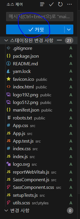
$ git add .
$ git commit -m'Commit before yarn eject'
* 그리고 나서 yarn eject 명령어를 실행한다.

* 이제 프로젝트 디렉터리에 config 라는 디렉터리가 생성되었을 것이다. 그 디렉터리 안에 들어 있는 webpack.config.js를 열어 보자.
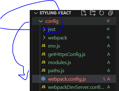
* 그 파일에서 "sassRegex"라는 키워드를 찾아보자(Ctrl + F). 두 번째 탐색 결과에서 다음과 같은 코드가 나타날 것이다.

* 여기서 use:에 있는 'sass-loader' 부분을 지우고, 뒷부분에 concat을 통해 커스터마이징된 sass-loader 설정을 넣어 주자.
            // Opt-in support for SASS (using .scss or .sass extensions).
            // By default we support SASS Modules with the
            // extensions .module.scss or .module.sass
            {
              test: sassRegex,
              exclude: sassModuleRegex,
              use: getStyleLoaders({
                importLoaders: 2,
                sourceMap: isEnvProduction && shouldUseSourceMap,
              }).concat({
                loader: require.resolve("sass-loader"),
                options: {
                  sassOptions: {
                    includePaths: [paths.appSrc + "/styles"],
                  },
                  sourceMap: isEnvProduction && shouldUseSourceMap,
                },
              }),
              // Don't consider CSS imports dead code even if the
              // containing package claims to have no side effects.
              // Remove this when webpack adds a warning or an error for this.
              // See https://github.com/webpack/webpack/issues/6571
              sideEffects: true,
            },
* 설정 파일을 저장한 후, 서버를 껐다가 재시작해 보자. 이제 utils.scss 파일을 불러올 때 현재 수정하고 있는 scss 파일 경로가 어디에 위치하더라도 앞부분에 상대 경로를 입력할 필요 없이 styles 디렉터리 기준 절대 경로를 사용하여 불러올 수 있다.
* 개발 서버가 시작하지 않나요?

- yarn eject 이후 개발 서버가 제대로 시작되지 않는 현상이 발생한다면 프로젝트 디렉터리의 node_modules
  디렉터리를 삭제한 후, yarn install 명령어를 실행하고 나서 yarn start를 해 보세요.
* SassComponent.scss 파일에서 import 구문을 다음과 같이 한번 수정해 보자. 그리고 똑같이 적용되는지 확인해 보자.
@import 'utils.scss';* 이제부터 utils.scss를 사용하는 컴포넌트가 있다면 위 한 줄만 넣어 주면 된다.
* 하지만 새 파일을 생성할 때마다 utils.scss를 매번 이렇게 포함시키는 것도 귀찮을 수 있을 텐데, 이에 대한 해결 방법 또한 있다. 그럴 때는 sass-loader의 data 옵션을 설정하면 된다. data 옵션을 설정하면 Sass 파일을 불러올 때마다 코드의 맨 윗 부분에 특정 코드를 포함시켜 준다.
* webpack.config.js를 열어서 조금 전 수정했던 sass-loader의 옵션에 있는 data 필드를 다음과 같이 설정해 보자.

            // Opt-in support for SASS (using .scss or .sass extensions).
            // By default we support SASS Modules with the
            // extensions .module.scss or .module.sass
            {
              test: sassRegex,
              exclude: sassModuleRegex,
              use: getStyleLoaders({
                importLoaders: 2,
                sourceMap: isEnvProduction && shouldUseSourceMap,
              }).concat({
                loader: require.resolve("sass-loader"),
                options: {
                  sassOptions: {
                    includePaths: [paths.appSrc + "/styles"],
                  },
                  sourceMap: isEnvProduction && shouldUseSourceMap,
                  prependData: `@import 'utils';`,
                },
              }),
              // Don't consider CSS imports dead code even if the
              // containing package claims to have no side effects.
              // Remove this when webpack adds a warning or an error for this.
              // See https://github.com/webpack/webpack/issues/6571
              sideEffects: true,
            },
* 이렇게 작성하고 개발 서버를 재시작하고 나면 모든 scss 파일에서 utils.scss를 자동으로 불러오므로, Sass에서 맨 윗줄에 있는 import 구문을 지워도 정상적으로 작동할 것이다.
(3) node_modules에서 라이브러리 불러오기
* Sass의 장점 중 하나는 라이브러리를 쉽게 불러와서 사용할 수 있다는 점이다. yarn을 통해 설치한 라이브러리를 사용하는 가장 기본적인 방법은 무엇일까? 다음과 같이 상대 경로를 사용하여 node_modules까지 들어가서 불러오는 방법이다.
@import '../../../node_modules/library/styles';* 하지만 이런 구조는 스타일 파일이 깊숙한 디렉터리에 위치할 경우, ../ 를 매우 많이 적어야 하니 번거롭다. 이보다 더 쉬운 방법이 있는데, 바로 물결 문자(~)를 사용하는 방법이다.
@import '~library/styles';* 물결 문자를 사용하면 자동으로 node_modules에서 라이브러리 디렉터리를 탐지하여 스타일을 불러올 수 있다.
* 연습 삼아 유용한 Sass 라이브러리 두 가지를 설치하고 사용해 보자. 반응형 디자인을 쉽게 만들어 주는 include-media와 매우 편리한 색상 팔레트인 open-color를 yarn 명령어를 사용하여 설치해 보자.
include-media.com
Check the most important breakpoints of responsive web design and media, the top SASS libraries and tips for the multi-platform app development.
include-media.com
https://www.npmjs.com/package/open-color
open-color
Open color scheme for web UI. Latest version: 1.9.1, last published: 2 years ago. Start using open-color in your project by running `npm i open-color`. There are 73 other projects in the npm registry using open-color.
www.npmjs.com
$ yarn add open-color include-media* 그 다음에는 utils.scss 파일을 열고 물결 표시를 사용하여 라이브러리를 불러오자. 다음 두 줄을 코드 상단에 넣어 주면 된다.
@import '~include-media/dist/include-media';
@import '~open-color/open-color';

// 변수 사용하기
$red: #fa5252;
$orange: #fd7e14;
$yellow: #fcc419;
$green: #40c057;
$blue: #339af0;
$indigo: #5c7cfa;
$violet: #7950f2;

// 믹스인 만들기(재사용되는 스타일 블록을 함수처럼 사용할 수 있음)
@mixin square($size) {
    $calculated: 32px * $size;
    width: $calculated;
    height: $calculated;
}
* Sass 라이브러리를 불러올 때는 node_modules 내부 라이브러리 경로 안에 들어 있는 scss 파일을 불러와야 한다. 보통 scss 파일 경로가 어디에 위치하고 있는지를 라이브러리의 공식 메뉴얼에서 알려 주지 않을 때가 많으니, 직접 경로로 들어가서 확인하길 바란다.
* 이제 방금 불러온 include-media와 open-color 를 SassComponent.scss 에서 사용해 보자. 해당 스타일 파일을 다음과 같이 수정해 보자.
.SassComponent {
display: flex;
background: $oc-gray-2;
@include media('<768px') {
background: $oc-gray-9;
}
.box { // 일반 CSS에서는 .SassComponent .box와 마찬가지
background: red;
cursor: pointer;
transition: all 0.3s ease-in;
&.red {
// .red 클래스가 .box와 함께 사용되었을 때
background: $red;
@include square(1);
}
&.orange {
background: $orange;
@include square(2);
}
&.yellow {
background: $yellow;
@include square(3);
}
&.green {
background: $green;
@include square(4);
}
&.blue {
background: $blue;
@include square(5);
}
&.indigo {
background: $indigo;
@include square(6);
}
&.violet {
background: $violet;
@include square(7);
}
&.hover {
// .box에 마우스를 올렸을 때
background: black;
}
}
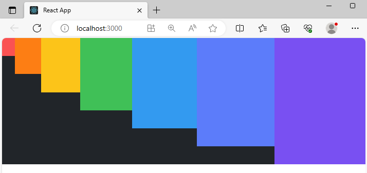
}* 이 코드는 SassComponent의 배경색을 open-colors 팔레트 라이브러리에서 불러온 후 설정하고, 화면 가로 크기가 768px 미만이 되면 배경색을 어둡게 바꿔 준다. 코드를 저장하고 나면 다음과 같은 결과물이 나타난다.

* 만약 안되시는 분이 있다면 다음의 설정을 참조하자.
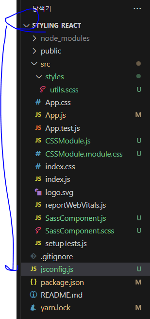
module.exports = {
  compilerOptions: {
    baseUrl: "src",
  },
  include: ["src/**/*"],
};
@import '~include-media/dist/include-media';
@import '~open-color/open-color';
// 변수 사용하기
$red: #fa5252;
$orange: #fd7e14;
$yellow: #fcc419;
$green: #40c057;
$blue: #339af0;
$indigo: #5c7cfa;
$violet: #7950f2;
// 믹스인 만들기(재사용되는 스타일 블록을 함수처럼 사용할 수 있음)
@mixin square($size) {
$calculated: 32px * $size;
width: $calculated;
height: $calculated;
}@import './styles/utils';
.SassComponent {
display: flex;
background: $oc-gray-2;
@include media('<768px') {
background: $oc-gray-9;
}
.box { // 일반 CSS에서는 .SassComponent .box와 마찬가지
background: red;
cursor: pointer;
transition: all 0.3s ease-in;
&.red {
// .red 클래스가 .box와 함께 사용되었을 때
background: $red;
@include square(1);
}
&.orange {
background: $orange;
@include square(2);
}
&.yellow {
background: $yellow;
@include square(3);
}
&.green {
background: $green;
@include square(4);
}
&.blue {
background: $blue;
@include square(5);
}
&.indigo {
background: $indigo;
@include square(6);
}
&.violet {
background: $violet;
@include square(7);
}
&.hover {
// .box에 마우스를 올렸을 때
background: black;
}
}
}import React from "react";
import "./SassComponent.scss";
const SassComponent = () => {
return (
<div className="SassComponent">
<div className="box red"></div>
<div className="box orange"></div>
<div className="box yellow"></div>
<div className="box green"></div>
<div className="box blue"></div>
<div className="box indigo"></div>
<div className="box violet"></div>
</div>
);
};
export default SassComponent;import React, { Component } from "react";
// import CSSModule from "./CSSModule";
import SassComponent from "./SassComponent";
class App extends Component {
render() {
return (
<div>
<SassComponent />
</div>
);
}
}
export default App;'React > React_리액트 시작' 카테고리의 다른 글
| (23) 컴포넌트 스타일링 3 (1) | 2023.12.05 |
|---|---|
| (22) 컴포넌트 스타일링 2 (0) | 2023.12.05 |
| (20) Hooks 2 (1) | 2023.12.04 |
| (19) Hooks 1 (0) | 2023.12.04 |
| (18) 컴포넌트의 라이프사이클 메서드 2 (1) | 2023.12.04 |


